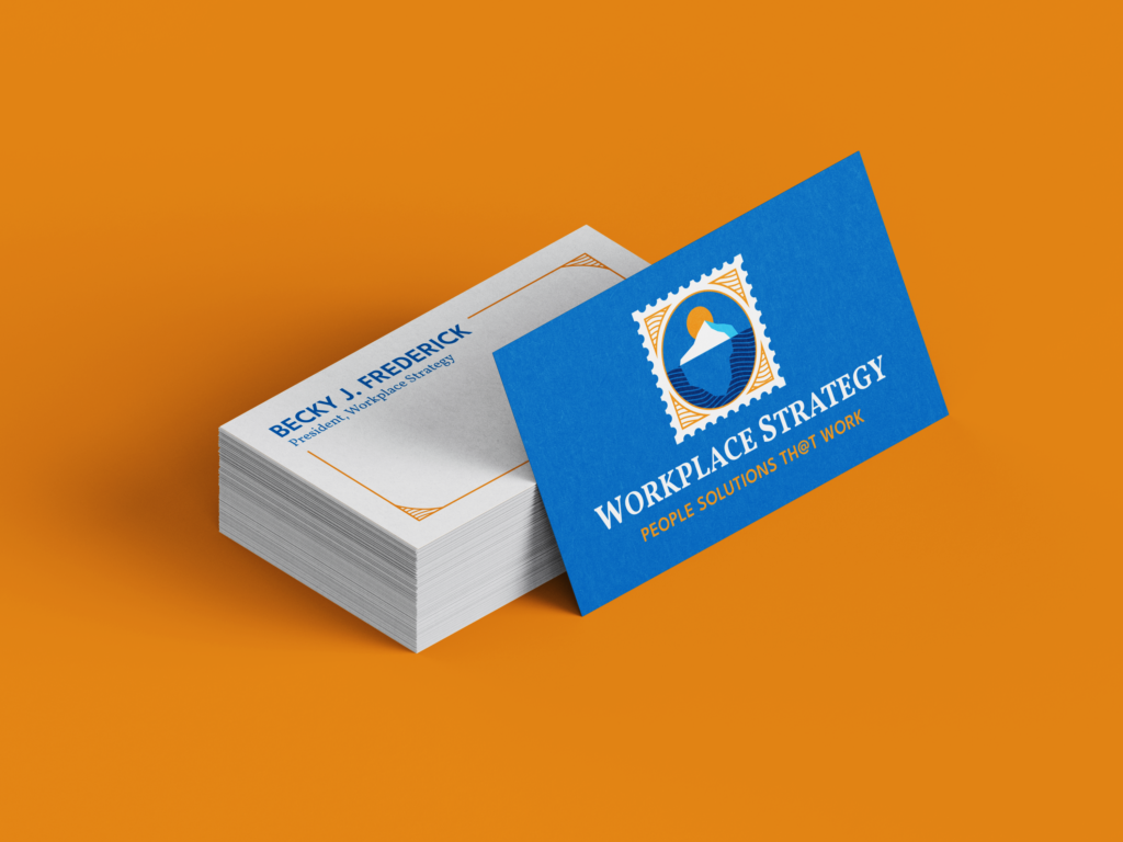
Workplace Strategy – Rebranding and Website Design
Workplace Strategy, Inc. is a boutique consulting firm based in Chicago with a focus on building healthy work environments. After 25 years of business relying on simply word of mouth, founder and primary consultant Becky J. Frederick reached out to me to establish a new brand identity and website for the company.
My goal with this project was to create a design that reflected Becky’s work and her personality, as both are vital to Workplace Strategy’s business.
Project Scope
– Discovery & Strategy
– Brand Identity System
– Print and Digital Collateral
– Typography & Color
– Web Design
Visual Identity
Frederick’s consulting draws on her extensive experience in the workforce, but also her experience as a world traveler. She has traveled to all seven continents and wanted to make her explorations central to her new visual identity.
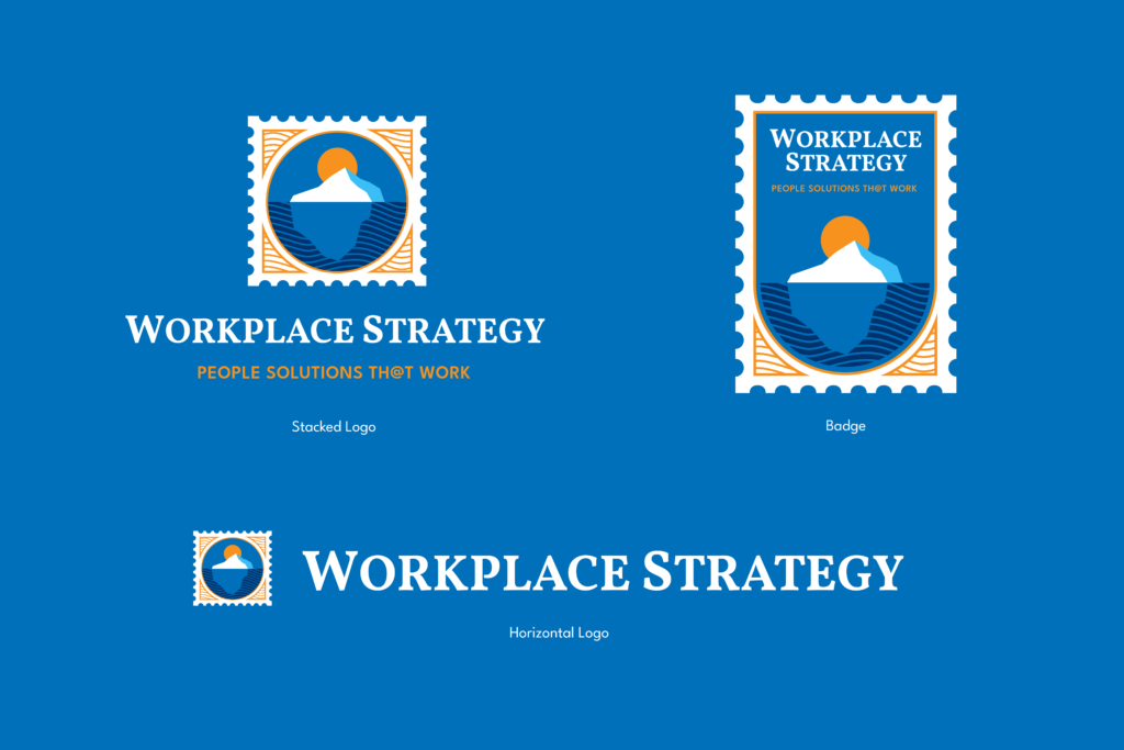
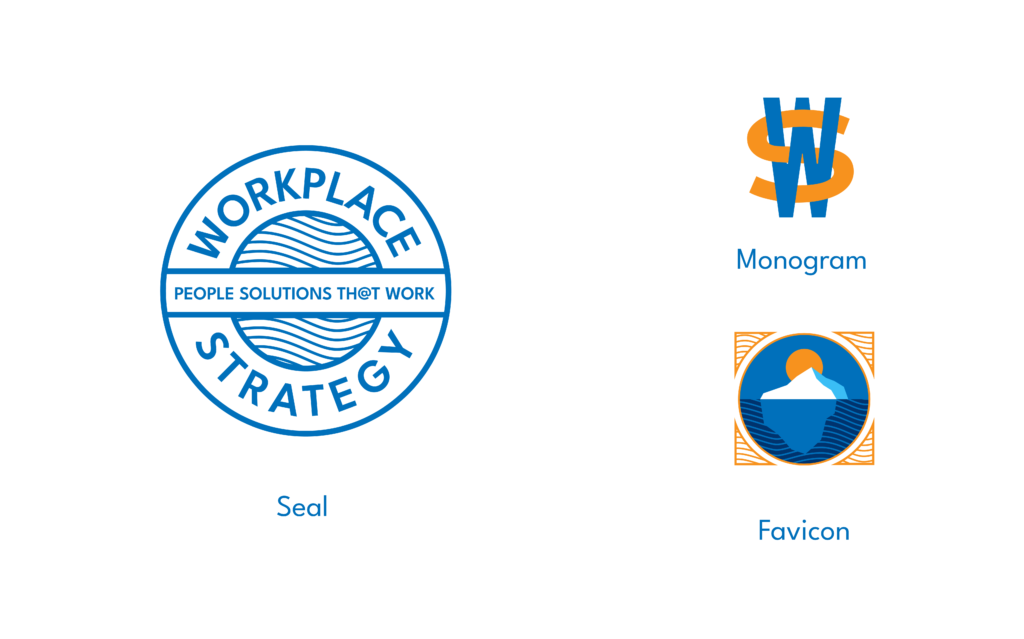
The logo, with the iceberg symbolizing both a metaphor Becky uses in her presentations as well as Becky’s most remote travels to Antarctica, brings these worlds together. The inspiration for the logo draws heavily from vintage luggage stickers and passport stamps, relics of early 20th century global travel. But because Workplace Strategy is a forward thinking company, I didn’t want the visual identity to be mired in the past. Bold colors and clean lines help bring the design into the 21st century.
Website
Upon beginning this project, Workplace Strategy did not have a website beyond a “Coming Soon” page with the company’s contact info. That gave us a clean slate to really think about what kind of website we wanted to create and how we wanted to position the company going forward.
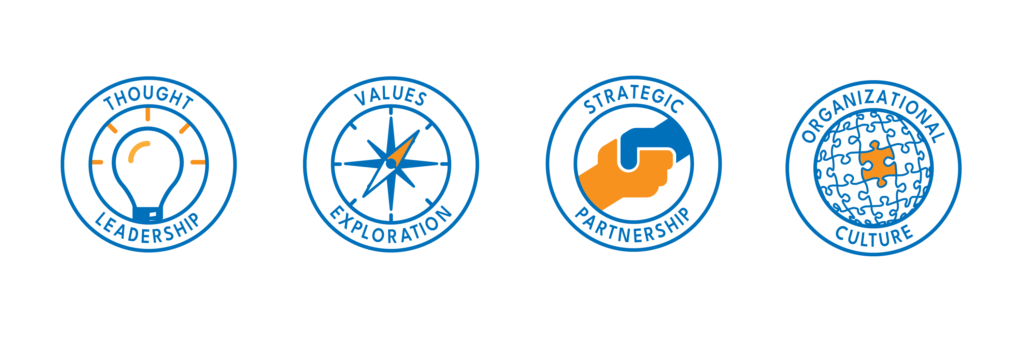
Over the course of her years in the business, Becky has done a wide variety of work for a wide variety of clients. For the website, however, we wanted to focus on the aspects of Workplace Strategy’s business where Becky is most interested in continuing to work. To help visually define these areas of work, I created a series of icons and seals representing each facet of Workplace Strategy’s business.
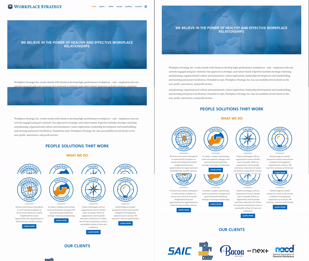
For the website, I customized a WordPress theme to match Workplace Strategy’s updated brand. The resulting website is clean, easy to navigate, and gives potential clients a clear sense of what Becky does and who she is.
Colors & Typography
Although the logos draw inspiration from vintage travel stickers, the color scheme is far from antique. The bright and bold colors reflect Becky’s personality. The color scheme is an array of blues–the deep blue of the sky, the navy blue of the sea, the icy blue of the iceberg–accented by a bright orange.

The wordmark is set in Vollkorn, a bold serif designed by Friedrich Althausen. Headlines are set in League Spartan Demi Bold, which was designed by Caroline Hadilaksono, Micah Rich, and Tyler Finck. League Spartan’s geometric forms evoke the Deco-inspired type of 1920’s travel posters without coming off as antiquated.
