Adobe & Teardrops – Rebranding and Website Overhaul
Adobe & Teardrops is a long-time country and roots music blog run by Rachel Cholst. The site is a champion of independent artists and is committed to representing voices in the Americana world that are too-often overlooked: women, BIPOC, and LGBTQ+ individuals. On the eve of Adobe & Teardrops’ 10th anniversary, Rachel approached me to establish a brand-new visual identity for the blog. As our conversations continued, the project’s scope expanded to encompass a complete website redo.
Our goal was to create a design steeped in the visual history of country music while remaining bright, inclusive, and most importantly, highly functional to the reader.
Project Scope
– Discovery & Strategy
– Brand Identity System
– Typography & Color
– Web Design
Visual Identity
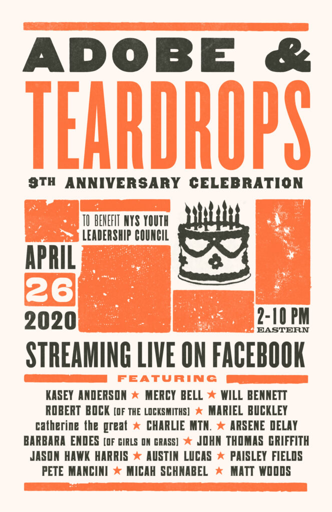
I had previously collaborated with Rachel on a poster for an Adobe & Teardrops livestream event. That poster–heavily influenced by the letterpress designs of Nashville’s Hatch Show Print–served as the jumping off point for the site’s new visual identity.
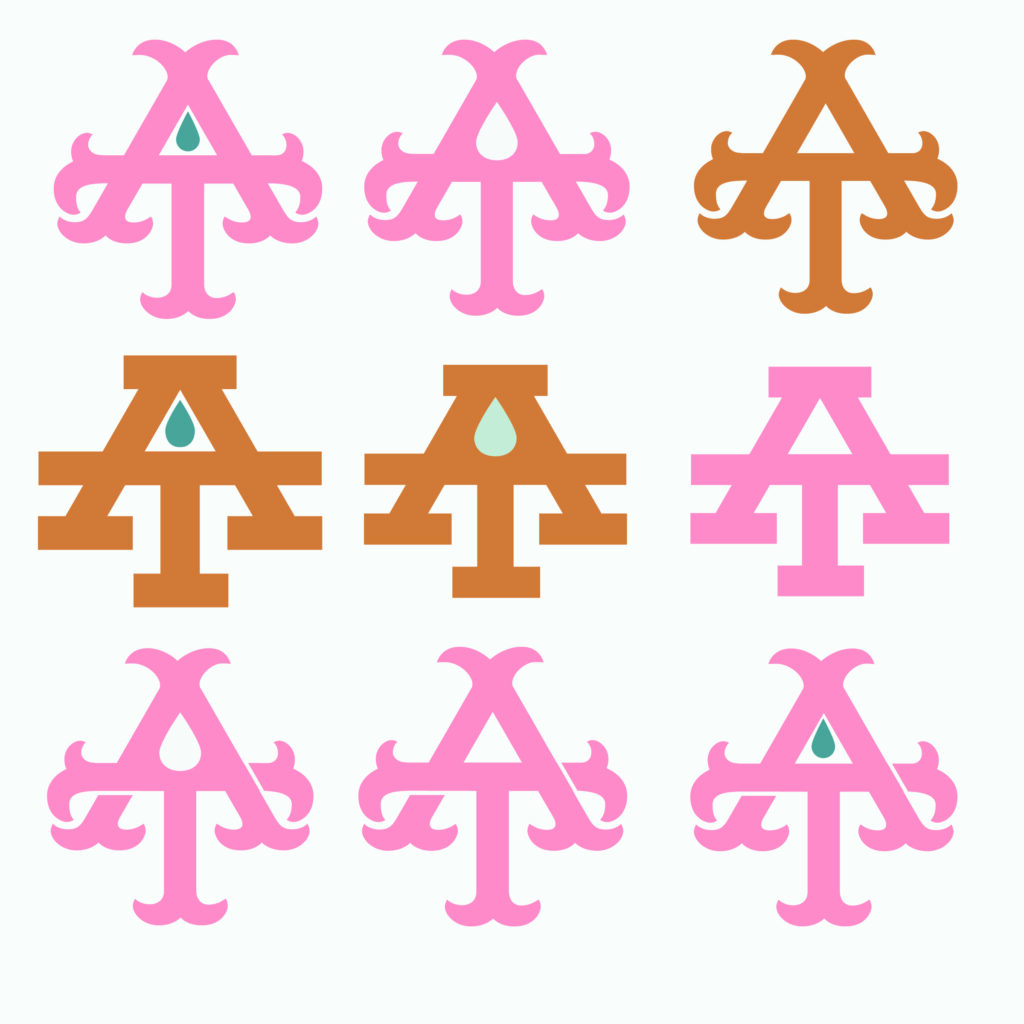
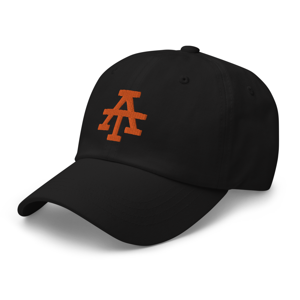
As Rachel and I are both avid baseball fans, I wanted to design a baseball cap-inspired monogram and favicon for the site. We went through numerous iterations of the monogram before ultimately settling on the final design–a classic slab serif monogram that evokes classic, mid-century baseball cap logos.
Color & Typography
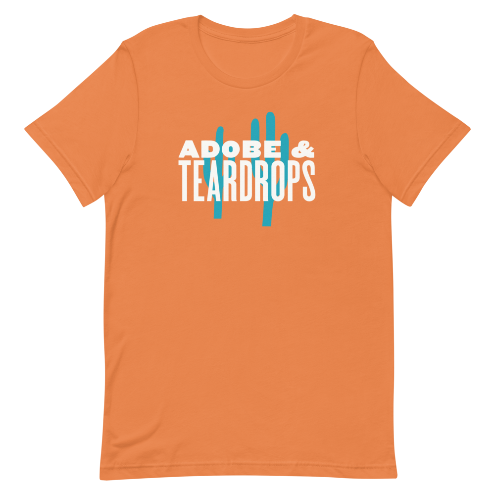
The name “Adobe & Teardrops” immediately calls to mind the orange and blues of the American Southwest, which served as the inspiration for the site’s new color scheme. For the specific colors I turned to the Hatch Show Print archives–a wonderful design resource containing a century’s worth of poster designs–for orange and teal tones that reflect the analog warmth of ink on paper.

Headlines are set in MPI Gothic, a bold letterpress-era type revival by John Bonadies that retains some of the quirks of wood type alphabets while remaining legible. The blog’s body copy is set in Roboto, a neo-grotesque sans serif by Christian Robertson built for readability.
Website
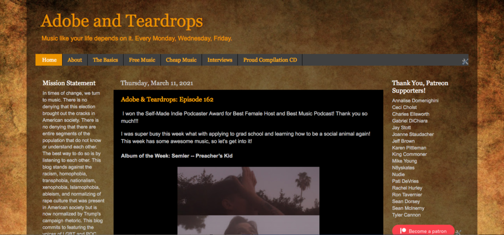
Since its humble origins as a free blogger site in 2011, Adobe & Teardrops has grown in scope from album reviews to also include artist interviews, song premieres, and a podcast with over 150 episodes. The original site’s layout was hard to read and hard to navigate for all but the most recent posts.
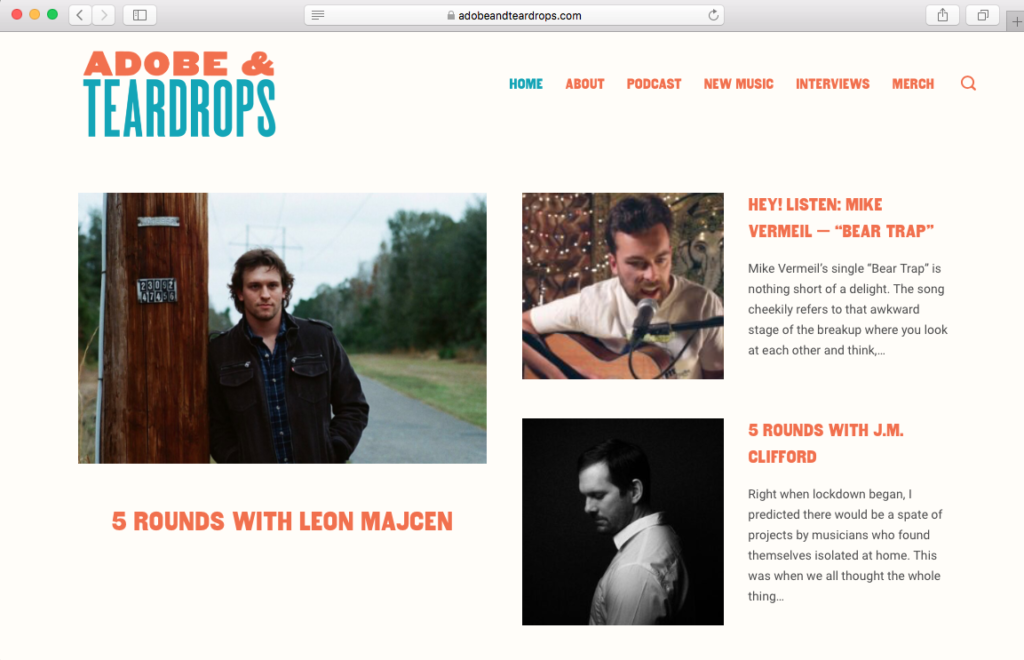
This project called for a clean, responsive website that made it easy to navigate to the site’s various kinds of content: podcast episodes, new music, and interviews. The new Adobe & Teardrops website is a modified WordPress theme with custom icons, colors, and typography to match the revamped brand.
In order to offset the additional costs of moving the site from the free Blogger platform to a self-hosted WordPress site, I set up a print-on-demand merchandise shop using Printful and Square. Plus, there was no way we weren’t going to put the monogram on a ballcap.
I have been reading Adobe & Teardrops regularly since 2015, so it was an honor to have the opportunity to tackle this project, and I’m so excited to see where the blog goes from here. Visit adobeandteardrops.com to check out the updated design in action. Maybe you’ll find your new favorite band too!