Engleman Communications – Visual Identity
Engleman Communications is the brainchild of Joe Engleman, a public relations specialist based in Chicago. Joe and I have been friends dating back to college, so I was super excited to help his new PR business get off the ground with a visual identity. Before starting Engleman Communications, Joe had worked on a variety of PR projects, ranging from political campaigns to the non-profit sector.
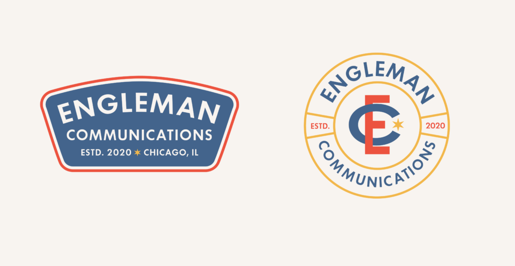
Because of Engleman’s work in these areas, I set out to create a visual identity that reflected the firm’s hard-working and quintessentially American ethos.
Project Scope
– Discovery & Strategy
– Brand Identity System
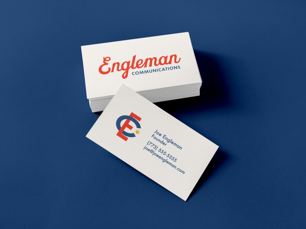
– Business Cards
– Typography & Color
Visual identity
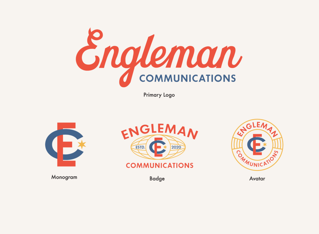
Color & Typography
Although we explored numerous color schemes throughout the process, we kept coming back to the primary colors of WPA-era poster design. The lightly faded colors feel lived in.

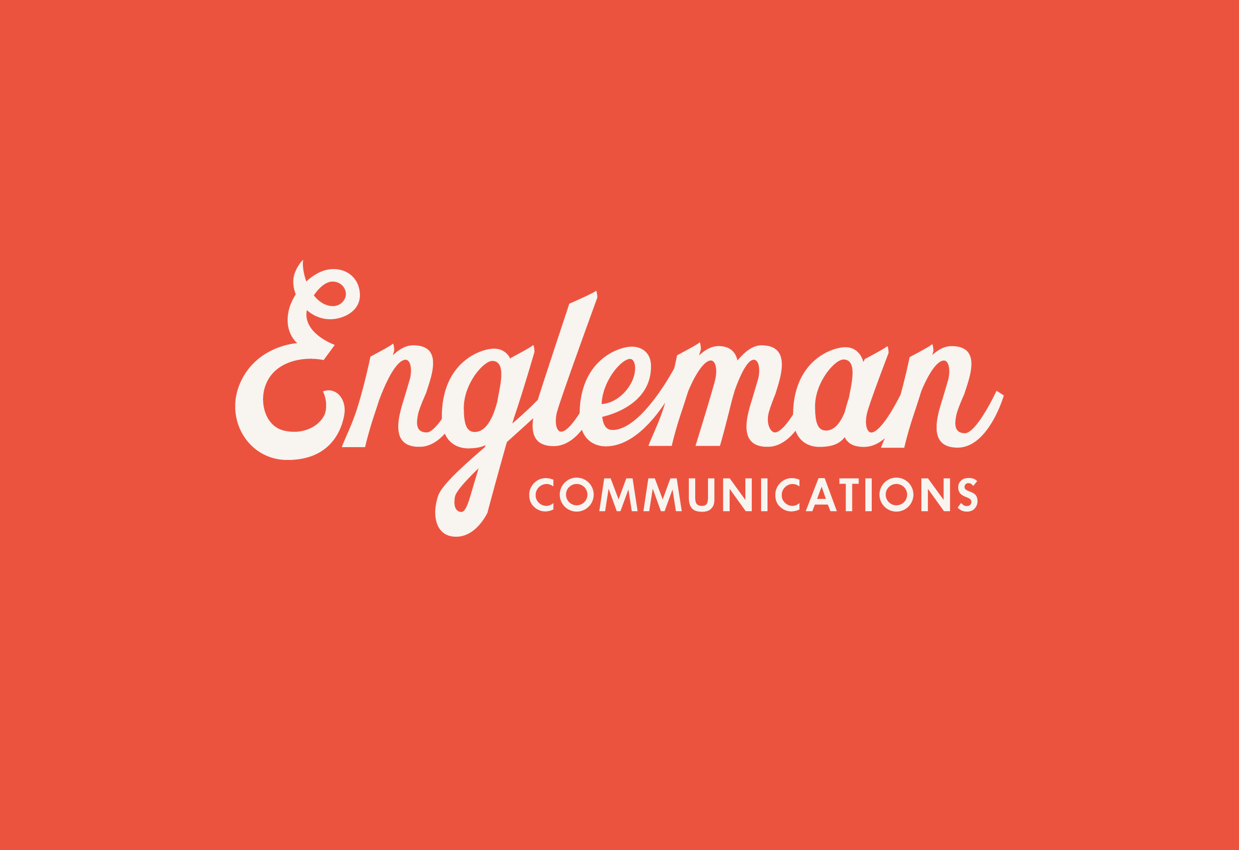
The custom lettering in the wordmark evokes the classic scripts of Coca-Cola, Ford, and Miller–all iconic American brands of the 20th century. The angled ascenders add a playful touch to the otherwise muscular script. For the project’s other text, the design called for a typeface flexible enough to work for both headlines and body copy. Something sturdy and timeless. Futura was a natural choice.